Risk Prediction
|
Software |
|
|
Websites |
|
|
Courses |
Overview
This page briefly describes Risk Prediction and provides an annotated resource list.
Description
Why risk prediction?
Risk prediction is relevant to many questions in clinical medicine, public health, and epidemiology, and the predicted risks of a specific diagnosis or health outcome can be used to support decisions by patients, doctors, health policy makers, and academics (Table 1). The current emphasis of the National Institutes of Health (NIH) on Precision Medicine and Patient-Centered Outcomes Research Initiatives (PCORI) are consistent with the broader cultural zeitgeist that individuals’ needs can and should be predicted and met in a personalized, dynamic manner (e.g., Netflix). However, the success of such NIH initiatives obviously depends on the adequate performance of underlying risk prediction models.
Table 1. Illustrating potential applications of risk prediction models: answering questions, supporting decisions
| Domain | Question regarding risk | Decision based upon risk |
| Clinical Medicine | “Will I have a heart attack” | Aspirin or no aspirin |
| Public health | “How many public housing residents will have a heart attack this year?” | Quantity and location of defibrillators in housing project |
| Epidemiology | “How many heart attacks do I expect in the control arm of my clinical trial?” | Enroll more or fewer participants |
Evaluating the performance of risk prediction models: a stepwise approach
For a detailed reference on issues regarding the design, conduct, and analysis of prediction studies, researchers should review the recently published statement on Transparent Reporting of a multivariable prediction model for Individual Prognosis or Diagnosis (TRIPOD): explanation and elaboration” (1). It addresses foundational concepts such as the importance of data quality and integrity, correct model specification, internal and external validation of the model, and rigorous assessments of model performance. Specific procedures for assessing risk prediction model performance – which were also described clearly and concisely in a recent review by leading methodologists (2) – can be summarized into three basic steps (Figure 1).
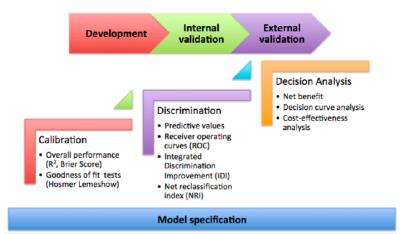
Figure 1. Schematic representation of the recommended steps to evaluate risk prediction models.Correct model specification is a necessary foundation. The three evaluative steps – calibration, discrimination, and decision analytic assessments – should be performed and compared across development as well as validation datasets.
Step 1. Calibration: how well do model-based estimates align with observed outcomes?
Determining how far predicted values fall from the observed values is the basis for a number of overall model performance measures, such as the R2. Prediction models frequently have binary outcomes (e.g., disease or no disease, event or no event), so model fit is often quantified via theNagelkerke’s R2 and the Brier Score.
A common test of model calibration is the Hosmer-Lemeshow test, which compares the proportion of observed outcomes across quantiles of predicted probabilities. Deciles are often used, but this is arbitrary. The Hosmer-Lemeshow test will provide a p-value, which reflects the probability that your null hypothesis – that there is no difference between the distribution of predicted and observed outcomes across quantiles – is correct (in other words, this is a situation in which a very large p-value should make the analyst quite pleased).
More important than this p-value, however, is the calibration plot that can be used to visualize what the Hosmer-Lemeshow test is testing. Calibration plots are often an excellent manner to evaluate the successes and/or failures of your predictions. Furthermore, a smoothed line can be fit over the plot, from which a calibration intercept and a calibration slope can be estimated. The intercept indicates the extent to which predictions are systematically too low or too high (“calibration-in-the-large”). Ideally, the slope should be close to 1. Although these conditions may be met in the development dataset, deviations in validation datasets are not uncommon, and are often attributable to the phenomenon of regression to the mean (Figure 2). Slopes less than 1 in validation set may indicate that the original model was overfitted and that there is a need for shrinkage of prediction model regression coefficients (3).
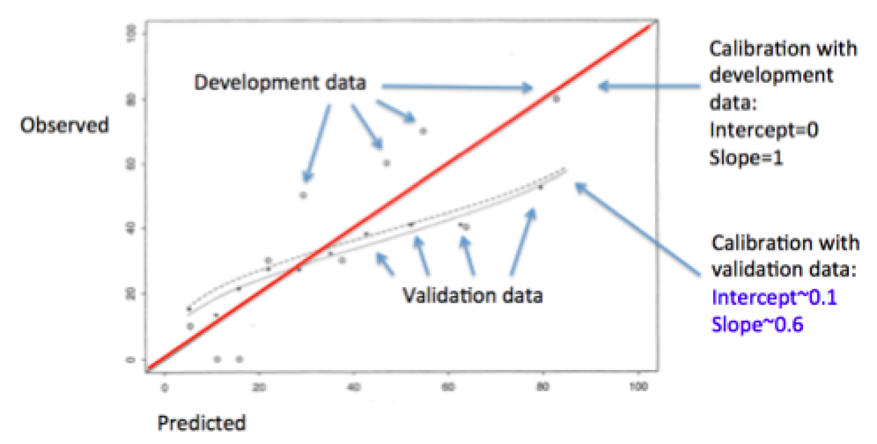
Figure 2. Prediction model overfitting and regression to the mean for outcome probability in validation datasets may be suggested by calibration slopes < 1 (figure from Copas JB, 1997).
Nonetheless, even when calibration plots are robust, they are rarely enough in risk prediction models: it is important to demonstrate that your prediction model can differentiate between persons with and without the outcome of interest (Figure 3).
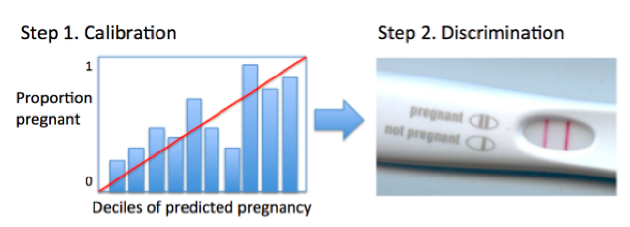
Figure 3. The limitations of calibration, or, “you can’t be half pregnant.”
Step 2. Discrimination: how well a model differentiates between subjects who will have the outcome from those who will not?
In the clinic, the value of a test (a predictor) is often judged by its positive and negative predictive values. What is the probability that you have the disease given a positive test? What is the probability that you don’t have the disease given a negative test? These are (relatively) easy to understand for both doctors and patients, and can be very useful in deciding whether to start treatment or whether to pursue more tests. Hence, assigning predictive values to new tests or new prediction models is important for many readers. It is essential to remember that these predictive values hinge on the prevalence (or, in Bayesian language, the prior probability) of disease in a given sample, so they may vary across validation samples.
Rather than predictive values, researchers frequently focus on receiver operating curves (ROCs). These are not prevalence dependent, at least in theory, since they are built up from measures of sensitivity (the true positive rate [TPR]) and specificity (1 – false positive rate [FPR]). The diagonal of the ROC plot represents the anticipated performance of a useless test, or chance alone; discrimination improves as the line indicating the TPR and FPR for each potential threshold of the test of interest nudges towards the upper left corner and the area under the curve (AUC; equivalent to the concordance or “c” statistic) increases. Optimal thresholds for a test may be defined using judgments regarding how important sensitivity is compared to specificity, or else something as simple as picking the point with the highest Youden’s index, which is just the vertical distance between the diagonal and the ROC curve (4). ROC curves also facilitate comparison of different predictive models, since they can be plotted on the same axes, and differences in the AUC can be simply calculated and statistically tested.
Of note, since ROCs are such a useful measure of discrimination, efforts have been made to extend them to survival model scenarios. This remains an area of active development, since one of the most attractive solutions, Herrell’s c, has been shown to be sensitive to censoring distributions (5).
Another area of active investigation in recent years has been establishing new measures ofincremental discrimination. There were two major problems observed with using AUC to evaluate new tests. First, in the context of a baseline model with a high AUC, it was difficult to demonstrate substantial improvements to the AUC with even highly promising new biomarkers. Second, it was shown that very well calibrated biomarkers may be associated with only a small change in the c-statistic despite providing relevant information for clinical reclassification (6). From this challenge emerged one paper in 2008 proposing two new methods: the net reclassification index (NRI) and the integrated discrimination improvement (IDI) index (7). As described by the original authors, the NRI is an objective way to quantify the effect of a new biomarker on changes in correct classifications versus incorrect classifications, while the IDI is a way to integrate net reclassification over all possible cutoffs. The formula for NRI is:
NRI = Pr(up-classify|has disease) – Pr(down-classify|has disease) – Pr(up-classify|no disease) + Pr(down-classify|no disease).
As noted by other authors, the NRI is not a proportion, but a sum of proportions, and thus its maximum value is 2 (8). It may also be understood as simply the change in the misclassification rate due to a new biomarker.
In contrast to the NRI, the IDI does not require cutoffs for classification since it integrates across all cutoffs:
IDI = (change in the integral of the TPR over all cutoffs) – (change in the integral of the FPR over all cutoffs)
The IDI may also be understood as simply the change in the discrimination slopes between the new and old model. Discrimination slopes are very simply defined as the average predicted probabilty of disease among those with disease minus the average predicted probability among those without disease.
Subsequent to their original publication, these methods were rapidly adopted by clinical researchers. Applications were extended to survival analysis, and – since cutpoints for categories could be arbitrary or vary over different samples – a “category-free” NRI was also developed (9).
In 2012, in the American Journal of Epidemiology, the original authors used simulated data to demonstrate the relatively decreased sensitivity (or, in the case of NRI, the completeinsensitivity) of the IDI and the NRI to the strength of the baseline model (10), and defended these measures’ complementary utility vis-à-vis the AUC. Two invited commentaries on this article were less sanguine (11, 12). Criticisms included the fact that the category-free NRI seems to demonstrate erratic and misleading behavior; significance tests were prone to over-interpretation; and, claims made by the original authors did not hold outside of very specific scenarios. Further criticism was presented in a compelling 2014 review (8), which highlights the interesting fact that rather than comparing old and new prediction models, NRI compares old and new individual predicted risks; such within-person changes do not necessarily equate to improved performance at the population level. So, although certain individuals might stand to benefit from a new risk score, it’s not possible to know which individuals will benefit, making this a relatively meaningless improvement. They demonstrate that even when a category-free NRI indicates a reasonably large number of changes in individual predicted risks (NRI=0.622), the distribution of predicted risks in the population may remain the same with the old model (solid line) and the new model (dotted lines) (Figure 4). They opine that the NRI may be overly optimistic and frankly misleading.

Figure 4. In these simulated examples, there is a minimal change in AUC, but NRI is relatively high (0.622). This is explained as the occurrence of many individual changes in risk values but no substantial change in distribution of predicted risks on the population level. (Figure from Kerr et al, 2014).
Kerr et al also agree with more global grievances with incremental risk prediction assessment that were raised by Greenland in 2008 in response to the original article proposing the IDI and NRI (13).
In addition to bemoaning the failure to account for disease prevalence into these measures, plus the incorporation of irrelevant information (e.g., the AUC includes information from cutoff ranges that are a priori unreasonable, such as 1% sensitivity?), Greenland emphasized a fundamental weakness inherent to all of the proposed measures of discrimination: they implicitly assign equal value to differences in true positive and false positive rates, even though this is almost always unrealistic. For instance, missing a diagnosis of breast cancer may result in not being treated – a major harm – whereas a false diagnosis of breast cancer may lead to an inconvenient but, more than likely, uncomplicated unnecessary biopsy (Figure 5). Since risk prediction is usually intended to support real life decisions, Greenland voices support for incorporating real life costs and benefits into our assessment of potential new biomarkers and our putative diagnostic and prognostic risk scores.
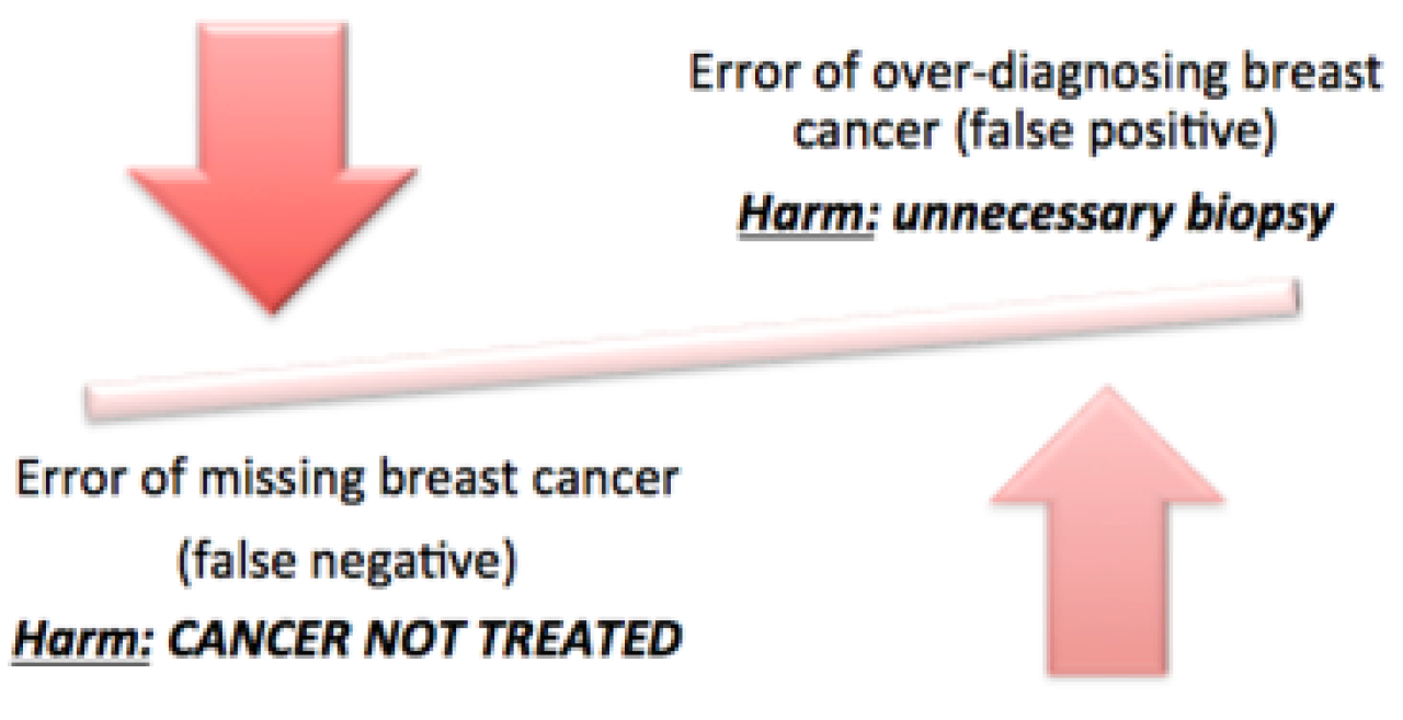
Figure 5. The harms caused by false negative and false positive prediction errors are rarely of equal weight.
Step 3. Decision analysis: how and when will the predictions impact actual decisions?
The idea of weighting different types of prediction errors according to their real-world impact is not new. It was clearly articulated over a century ago by CS Pierce (14), and it is a dominant analytical approach in many other fields. With regards to health-related decisions, “decision analysis” has mainly been applied to questions of health policy; however, it has not entered the standard “toolkit” of many epidemiologists.
Kerr et al (8) observed that a “weighted NRI” (9) is equivalent to Pierce’s Net Benefit (NB), which is defined as follows:
NB = benefit*(true positive rate) – harm*(false positive rate)
The NB is useful as a summary measure, although it may be challenging to assign the dimensions (Dollars? Disability adjusted life years?), let alone the values, for these parameters.
Fortunately, decision curve analysis does not require the analyst to apply or invent specific costs or benefits. Instead, they permit evaluation of the NB of a prediction rule over a range of cost : benefit weights, or “threshold probabilities” for a given treatment decision (Figure 6) (15, 16). Importantly, the relevant treatment decision must be specified.
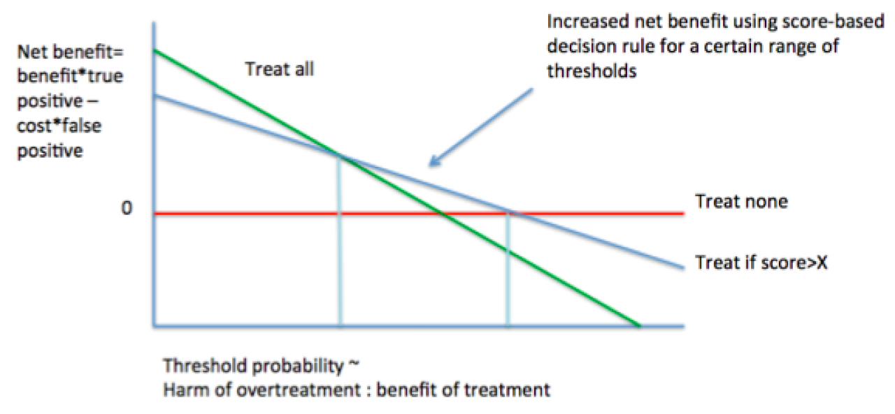
Figure 6. Basic decision curve analysis.
The qualitative interpretation of decision curves is reminiscent of ROCs, as “higher” decision curves with larger distances from the horizontal (NB=0) are, generally speaking, superior in terms of NB. By contrast, understanding the meaning of the axes and making quantitative conclusions requires some reorientation. The Y-axis is the NB, which may be positive or negative. The X-axis represents “threshold probabilities,” which can be explained in several different ways. From a patient-centered standpoint, the threshold probability can be described as “how high would my risk of disease have to be before I would decide to accept the treatment for that disease?” From an analytical standpoint, the threshold probability represents a dimensionless weighting of the harms of overtreatment to the benefits of treatment. Threshold probabilities near zero indicate that the benefits of treatment (of true positives) are perceived to eclipse the potential harms of overtreatment (of false positives), which could be due to the fact that the benefits are particularly high, or the harms are sufficiently low (e.g., vaccines). High threshold probabilities suggest that the benefits of treatment may be slim, or that the harms of overtreatment may be high (see recent controversies in prostate cancer screening). At the extremes of the X-axis, the NB of treating all or treating none often dominate; it is in between those extremes that new risk predictors may be expected to contribute, if at all.
Decision curve analysis can not only give a qualitative impression about (1) how much higher your new predictor’s decision curve is compared to other curves, and (2) over how large a range of threshold probabilities your new predictor seems to provide NB, but they can also be used to extract certain values the (3) magnitude of NB and (4) the number of unnecessary interventions avoided (Figure 7). These values may be especially useful for assessing and communicating the utility of a new test to patients, clinicians, and public health decision makers. For these reasons, the clinical literature appears to be adopting and even promoting the application of decision analytic techniques for evaluation of risk prediction models (17-19).

Figure 7. Basic example. For sore throat (disease), should you use a throat culture to determine whether to treat with antibiotics (decision)? If you weigh the harm of overtreatment with antibiotics against the benefit of appropriate treatment with antibiotics at 1:9 (threshold probability = 10%), then using this decision rule identifies 30 true positives per 100 patients without any overtreatment (net benefit).
In the broader arena of decision analytic techniques, decision curve analysis is obviously quite simplistic. A large number of more analytically sophisticated alternatives exist (e.g., multi-criteria decision support (20)). Even simpler representations have been developed as patient decision aids, which may indeed be beneficial in the clinical context (21).
Nonetheless, especially in light of easy-to-use programming options for SAS, STATA, and R (available, along with tutorials and additional articles, from www.decisioncurveanalysis.org), decision curve analysis may be seen both as a an accepted (1) and accessible decision analytic approach that complements standard epidemiological assessments of risk prediction and is.
Conclusions
Risk prediction modeling has important applications in clinical medicine, public health, and epidemiology. Best practices for developing, assessing, and validating risk prediction models continue to evolve. The longstanding principles of model calibration and discrimination remain important, and decision analytic approaches are also gaining support. Familiarity with the range of performance metrics is likely to be especially important for readers of clinical literature, in which questions of prediction are often paramount.
Readings
-
Moons KG, Altman DG, Reitsma JB, Ioannidis JP, Macaskill P, Steyerberg EW, et al. Transparent Reporting of a multivariable prediction model for Individual Prognosis or Diagnosis (TRIPOD): explanation and elaboration. Annals of internal medicine. 2015;162(1):W1-73. [Essential reading for persons planning to publish on prediction models.]
-
Steyerberg EW, Vickers AJ, Cook NR, Gerds T, Gonen M, Obuchowski N, et al. Assessing the performance of prediction models: a framework for traditional and novel measures. Epidemiology. 2010;21(1):128-38. [Excellent introduction to and overview of main performance measures for prediction models. This is a recommended entry point to the methodologic literature, as it is written by a number of the major methodologists, and presents a balanced perspective.]
-
Copas JB. Using regression models for prediction: shrinkage and regression to the mean. Statistical methods in medical research. 1997;6(2):167-83. [An accessible review of how regression to the mean affects prediction modeling.]
-
Youden WJ. Index for rating diagnostic tests. Cancer. 1950;3(1):32-5. [Describes the Youden’s Index.]
-
Pencina MJ, D’Agostino RB, Sr., Song L. Quantifying discrimination of Framingham risk functions with different survival C statistics. Statistics in medicine. 2012;31(15):1543-53. [Compares results for different c-statistics adapted for survival models.]
-
Cook NR. Use and misuse of the receiver operating characteristic curve in risk prediction. Circulation. 2007;115(7):928-35. [An important turning point down the path of reclassification methods; justifies inadequacy of ROC curves for evaluation of promising new biomarkers.]
-
Pencina MJ, D’Agostino RB, Sr., D’Agostino RB, Jr., Vasan RS. Evaluating the added predictive ability of a new marker: from area under the ROC curve to reclassification and beyond. Statistics in medicine. 2008;27(2):157-72; discussion 207-12. [The introduction of the IDI and the NRI.]
-
Kerr KF, Wang Z, Janes H, McClelland RL, Psaty BM, Pepe MS. Net reclassification indices for evaluating risk prediction instruments: a critical review. Epidemiology. 2014;25(1):114-21. [A principled argument against the utility of the NRI.]
-
Pencina MJ, D’Agostino RB, Sr., Steyerberg EW. Extensions of net reclassification improvement calculations to measure usefulness of new biomarkers. Statistics in medicine. 2011;30(1):11-21. [Presents extensions of the NRI, from its original authors.]
-
Pencina MJ, D’Agostino RB, Pencina KM, Janssens AC, Greenland P. Interpreting incremental value of markers added to risk prediction models. American journal of epidemiology. 2012;176(6):473-81. [Compares the AUC, IDI, and NRI using simulated data, arguing these are complementary approaches.]
-
Kerr KF, Bansal A, Pepe MS. Further insight into the incremental value of new markers: the interpretation of performance measures and the importance of clinical context. American journal of epidemiology. 2012;176(6):482-7. [Presents challenges to (10); of note, Kerr would later write a more withering assessment, (8).]
-
Cook NR. Clinically relevant measures of fit? A note of caution. American journal of epidemiology. 2012;176(6):488-91. [Presents challenges to (10); of note, Cook arguably was one of the first proponents of reclassification tables, in (6).]
-
Greenland S. The need for reorientation toward cost-effective prediction: comments on ‘Evaluating the added predictive ability of a new marker: From area under the ROC curve to reclassification and beyond’ by M. J. Pencina et al., Statistics in Medicine (DOI: 10.1002/sim.2929). Statistics in medicine. 2008;27(2):199-206. [Challenges the IDI proposed in (7) as well as the traditional AUC metrics based upon fundamental questions of applicability, and promotes a paradigm shift towards evaluating harms and benefits.]
-
Pierce CS. The numerical measure of the success of predictions. Science. 1884;4(93):453-4. [The “father of pragmatism” delivers a very clear and concise account of net benefit.]
-
Vickers AJ, Elkin EB. Decision curve analysis: a novel method for evaluating prediction models. Medical decision making : an international journal of the Society for Medical Decision Making. 2006;26(6):565-74. [A major proponent of decision curve analysis explains this approach.]
-
Steyerberg EW, Vickers AJ. Decision curve analysis: a discussion. Medical decision making : an international journal of the Society for Medical Decision Making. 2008;28(1):146-9. [A discussion of decision curve analysis in the context of medical decision making.]
-
Raji OY, Duffy SW, Agbaje OF, Baker SG, Christiani DC, Cassidy A, et al. Predictive accuracy of the Liverpool Lung Project risk model for stratifying patients for computed tomography screening for lung cancer: a case-control and cohort validation study. Annals of internal medicine. 2012;157(4):242-50. [An application of decision curve analysis published in a core clinical journal.]
-
Localio AR, Goodman S. Beyond the usual prediction accuracy metrics: reporting results for clinical decision making. Annals of internal medicine. 2012;157(4):294-5. [Published with (17), this calls for greater utilization of decision analysis in evaluating novel health predictors.]
-
Steyerberg EW, Vergouwe Y. Towards better clinical prediction models: seven steps for development and an ABCD for validation. European heart journal. 2014;35(29):1925-31. [An algorithm simular to the one described above for evaluating clinical prediction models that was published in a major clinical journal.]
-
Dolan JG. Multi-criteria clinical decision support: A primer on the use of multiple criteria decision making methods to promote evidence-based, patient-centered healthcare. The patient. 2010;3(4):229-48. [A clinical vignette is used to demonstrate how different decision analytic tools can be applied to real world situations.]
-
Stacey D, Legare F, Col NF, Bennett CL, Barry MJ, Eden KB, et al. Decision aids for people facing health treatment or screening decisions. The Cochrane database of systematic reviews. 2014;1:CD001431. [A recent systmetic review of the evidence for the use of decision aids in the context of health decisions.]
-
www.decisioncurveanalysis.org [This site was developed by AJ Vickers and is hosted by Memorial Sloan Kettering Cancer Center. It provides a large number of helpful resources, including code to develop decision curves in SAS, STATA, and R. It is an excellent first stop for anyone who wants to become more comfortable with decision curve analysis].